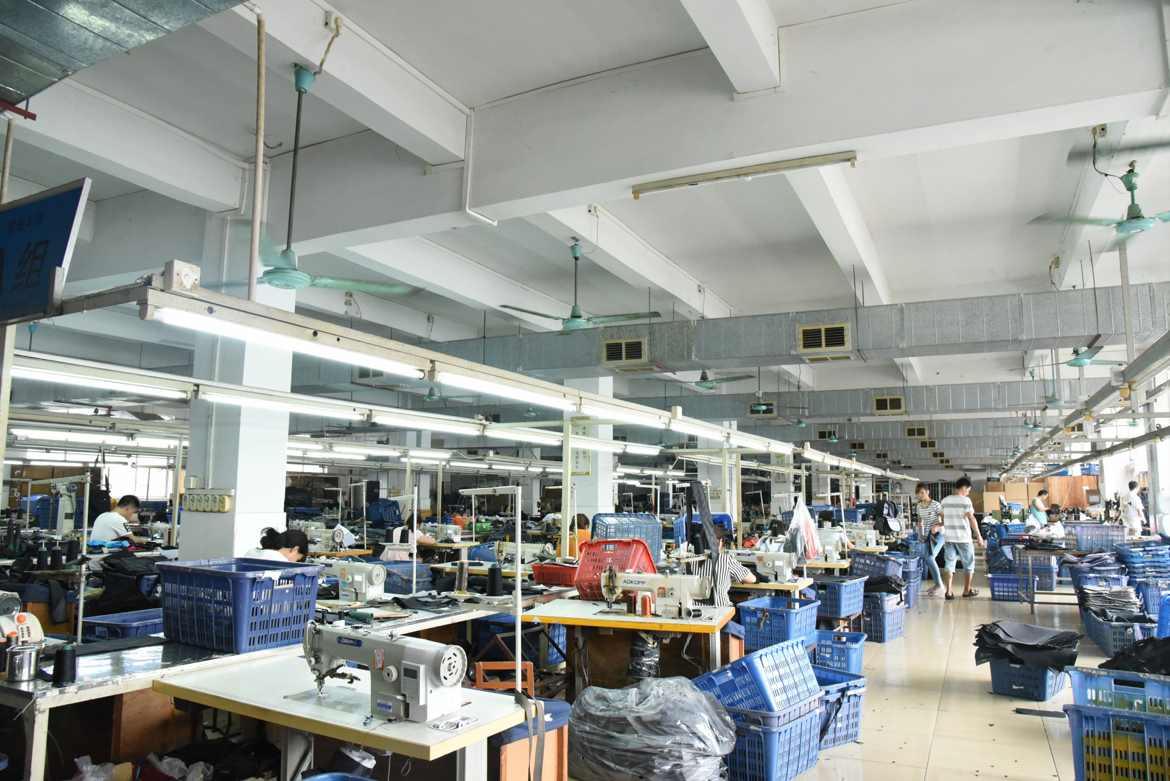
In serving so many clients in the past, I have had contact with many brand owners
From newly established startups, international market enterprises to listed companies, regardless of their size, they have all encountered similar problems in brand design. Brand design is not simply visual packaging, but a systematic engineering deeply linked to business logic, consumer needs, and market positioning.
Once the design deviates from the core goal, it will cost the company money but not achieve results. Today, based on some real industry data and service experience, let's talk about the "five most common problems in brand design" and how to avoid these pitfalls.
1.Lack of core message or focus on key points
Many brands want to express all information at once when designing: corporate culture, brand history, functional selling points, and future vision The posters, packaging, and official website are all filled with text and symbols, which consumers cannot understand or remember at all.
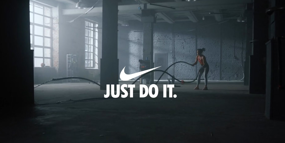
When consumers see a new brand, they only have "3-5 seconds" to convey its core values. If they can't grasp the key point at first glance, they will turn to the next choice. That's also why in North America, brands like Apple, Nike, and Tesla can almost resonate with people with just one symbol or sentence. Apple's "Think Different" doesn't have a complicated explanation, but it quickly makes consumers understand that this is a brand that values innovation.
We should extract the brand core of a sentence.
For example, we often conduct a "one sentence brand test" for our clients, requiring them to explain the brand's value in one sentence within ten seconds. If it's unclear, it means the core hasn't been focused yet.
2.Neglecting overall business needs
Only from an aesthetic perspective, but neglecting the commercial logic behind the design.
The result is that it looks beautiful, but it cannot be sold in the market. A successful brand must closely integrate its business goals with its design output.
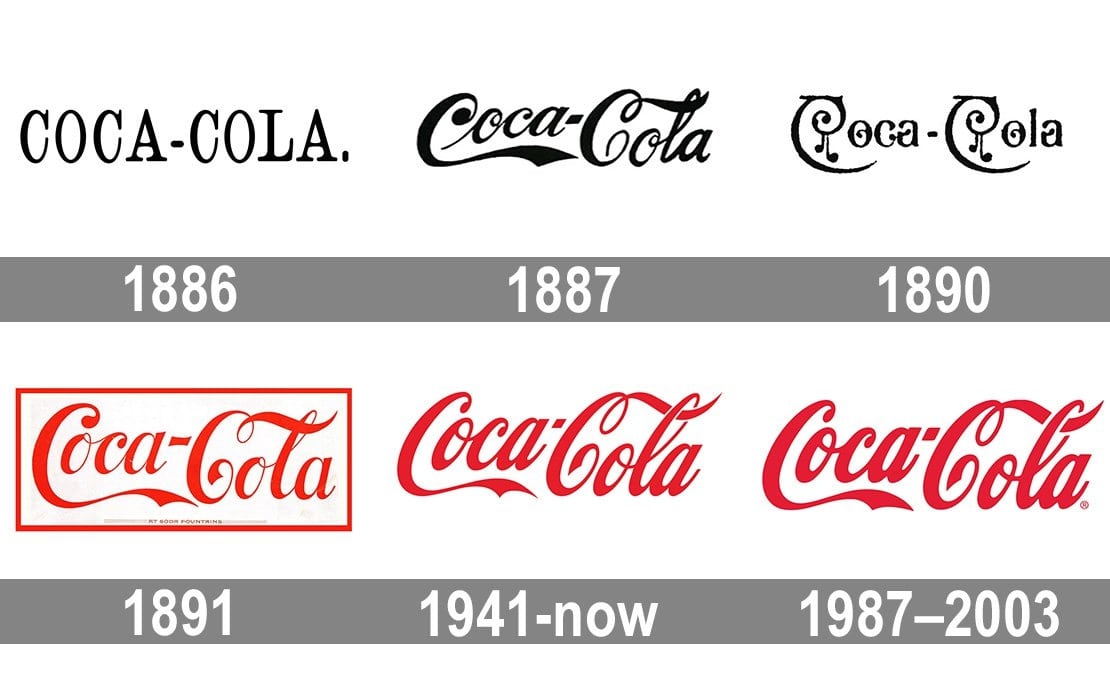
Coca Cola not only adjusted the lines of its logo during brand renewal, but also incorporated the communication needs of digital channels. They ensure visual consistency at every touchpoint on social media, packaging, and supermarket shelves. This' consistent experience 'allows consumers to quickly identify in any scenario, directly improving sales conversion.
We should design to be linked to 'user touchpoints'.
Whether it is brand design, brand reshaping and upgrading, or the visual design of the homepage of online Amazon brands and stores, it is necessary to ensure that consumers feel the same brand characteristics at every touchpoint.
3.Neglecting the preferences of the target customer group
If the brand design is self interested and only considers the boss's preferences without delving into the target consumer group. The result is that companies are satisfied, but consumers are not convinced.
Taking the North American market as an example, the 2024 Morning Consult Brand Survey shows that 72% of Generation Z consumers place greater emphasis on whether a brand "aligns with their values and aesthetics" when choosing a brand. This means that the younger generation's expectations for brands are no longer just about functionality, but also about cultural and emotional resonance.
We should create a 'consumer profile' before designing a brand
For example, if the style preferred by the 25-35-year-old population in North America is "simplicity+functionality"; We should conduct research from their consumption habits, preferences, aesthetic needs, and other aspects.
4.The design is too divergent and lacks consistency
The biggest fear of brand design is the lack of uniformity. Many companies have hired different designers at different stages, resulting in one style on their official website, another style on their packaging, and completely inconsistent image styles on social media.
This will cause consumers to have cognitive dissonance and even feel that the brand is "unprofessional"
Enterprises that maintain brand consistency have an average revenue 33% higher than their competitors. That's why, like Starbucks, whether you're in Shanghai, Guangzhou, New York, or Tokyo, the logo, store style, and cup design are almost identical. It brings consumers a stable sense of trust.
We should establish a brand visual manual.
It clearly specifies the usage of the logo, color standards, font specifications, and image style. This way, both internal teams and outsourced designers can maintain consistency.
Regularly undergo 'brand health check ups'. For example, check the visual output of all contacts once a year to see if there is any deviation.
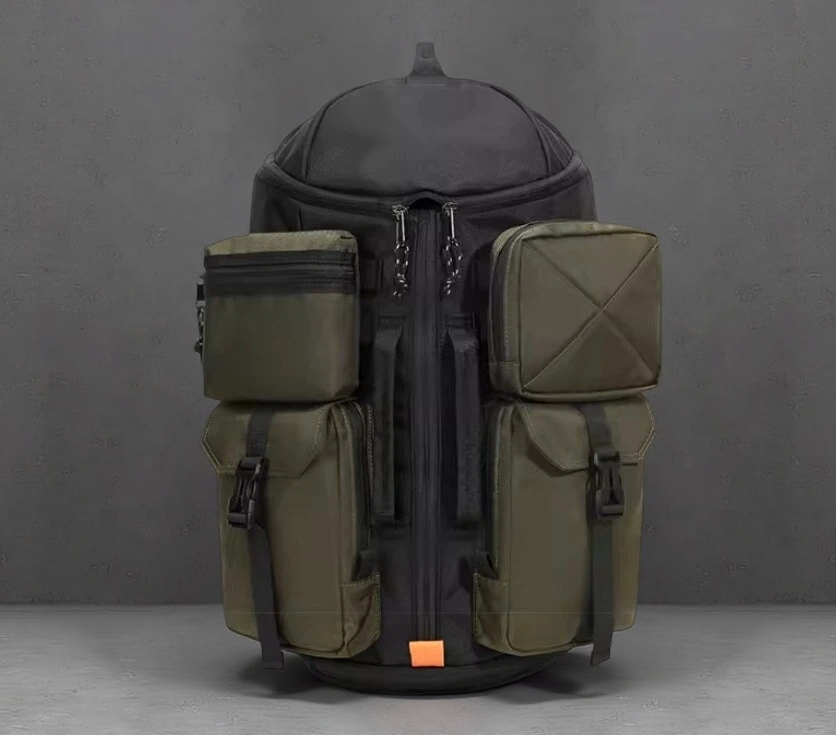
5.No market differentiation and memory points have been established
In a fiercely competitive market, if brand design lacks uniqueness, it will quickly be submerged in homogeneous products.
Especially in the e-commerce environment, when consumers browse dozens of similar products on Amazon or Shopee, only brands with clear memory points can stand out.
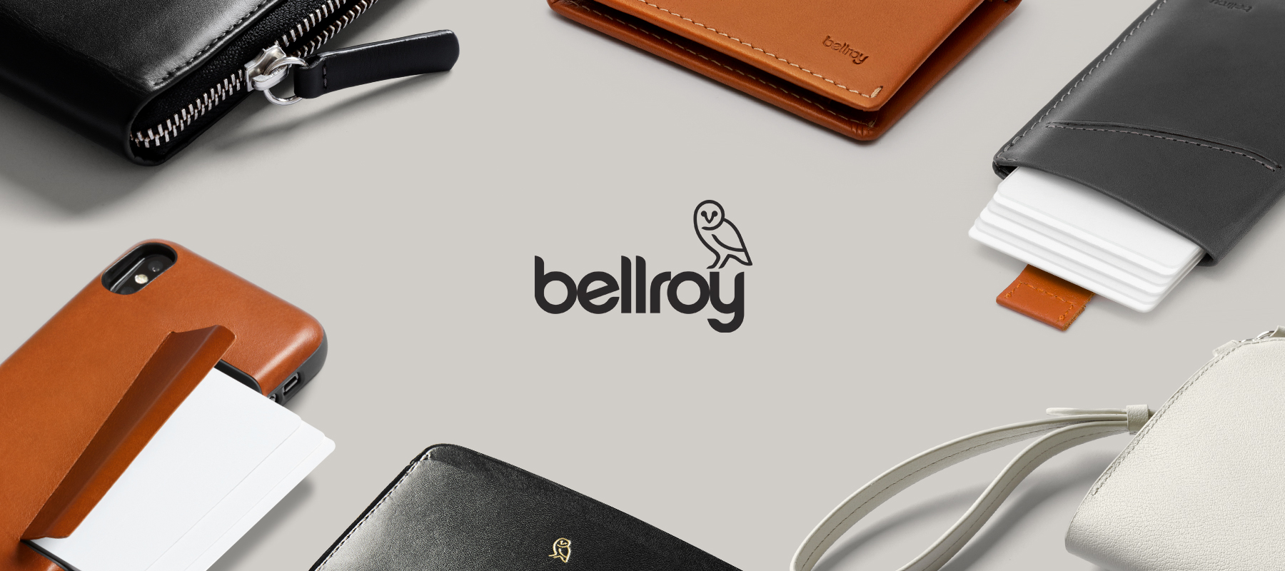
For example, the backpack market; The key to Bellroy's success lies in creating a differentiated symbol of "minimalism+eco-friendly materials". Brand core: minimalism, functional optimization, environmental protection and sustainability. Its backpack and travel bag not only have been finely optimized in terms of functionality (reasonable compartments, laptop protection, quick access pockets), but also emphasize sustainable values - using environmentally friendly leather and recycled materials to convey the concept of "responsible consumption".
We should find a 'soul symbol'.
It can be a unique pattern, color, texture, or even a slogan.
As long as you can make consumers think of you at the first time, it is considered successful.
Avoid following the trend in design. Many brands like to copy the style of their competitors, resulting in a loss of personality. Differentiation is not blind curiosity, but finding one's own unique path based on market research.
Brand design is not artistic creation.
Its value lies in being seen, understood, remembered, and ultimately transformed into results.